

WHAT: Data Art Show WHEN: Until July 1 WHERE: Pink Hobo Gallery, 507 Hennepin Ave. E. Back when this crop of college kids was in elementary school, computer class mostly involved learning ASDF, copy and paste and how to shoot buffalo on Oregon Trail. Boy did the education system miss the boat on this one, because in unique corners of the world, a few multitalented artists/code designers are computing their way into a whole new universe. Three of them ended up in Minneapolis last week to hit up the Flashbelt Interactive Conference, drink at NyeâÄôs Polonaise Room and be featured in the Pink HoboâÄôs Data Art Show. The gallery opening was a splash of well-dressed northeast dwellers sipping Grain Belts and chatting. This is the kind of art meant for drinking at and then stalking later, with the help of Google and Wikipedia. ItâÄôs information art, and thereâÄôs a lot of painstaking information behind it, too. Read on, as A&E attempts to explain. Artist No. 1 is James Paterson, also known as Presstube. Trained at Nova Scotia College of Art and Design, Paterson makes extra cash with his knowledge of programming and claims to have gotten an accidental education during the dot-com crisis. âÄúIt was reverse school,âÄù he said. âÄúIt was like getting a lesson in what you shouldnâÄôt do with your company.âÄù He spends a lot of his time making art games. As to what exactly that is, he suggests viewing them first hand, giving the somewhat transcendental explanation that theyâÄôre a âÄúcohesive world where all of my work could live and interact with each other.âÄù His piece for the Data Art Show is called âÄúCaress Me Like a Tropical Priest.âÄù Done with graphite on watercolor paper, it is a meandering mix of âÄúalmosts.âÄù That is almost a monster. That is almost a shoe. The white space left provides a harmonious balance to the chaos. Paterson created the piece from drawings in his sketchbooks, which he creates by skipping town and exploring motifs of what he calls âÄúmonsters and technology and perviness, all mixed together.âÄù He then uses technology he built to compile the images and âÄúsmashâÄù them into a composite. Finally, using a wall projector, he traces them with pencil. Jer Thorp, artist No. 2 and main brain behind the exhibit, explained that he wanted Paterson to be in the mix because âÄúhis result is purely analog. HeâÄôs drawing on a wall. I didnâÄôt want to have a whole bunch of art on the wall that was just purely digital work.âÄù Thorp, like Paterson, is also literate in programming, although he studied cell biology and genetics at the University of British Columbia. An auto-didact, art and programming were side passions that ended up defining his career. He has been featured in The New York Times Developer Network, won several awards and displays his work on his blog, blprnt. Interested in everything from Twitter to the frequency of mentions of words in news databases, his blog could give Aldous HuxleyâÄôs âÄúThe Doors of PerceptionâÄù a run for its money in terms of tilting perspectives on reality. Despite his innovative fusion of art, technology and genetics, he doesnâÄôt see himself as a frontier for any new movement. âÄúWhenever thereâÄôs a new piece of technology, very quickly people are starting to make art with it. ItâÄôs been happening since the âÄô60s, when computers were first developed and usable,âÄù he explains. He believes that data visualization is becoming a type of journalism, and as people gain the ability to interpret the workings of scripts like PHP, concepts such as Boolean logic and programs like Adobe Flash, a programmer will win a Pulitzer Prize. Data art, to him, fulfills a psychological need for consumers. âÄúWhen you see something that attempts to make sense of that information, I think itâÄôs quite rewarding to us.âÄù âÄúWe Are Beginning to See Positive Signs for our Industry âÄî Bear Stearns, Lehman Brothers, Freddie Mac & Fanny Mae :1984-2009,âÄù his featured work, is a tangled, elongated web of names and connections in all capital letters, printed on brown paper. Unlike many of his other projects, Thorp wanted the piece to be unclear, confusing. âÄúI wanted to see when data visualization isnâÄôt that successful. I wanted to throw a bit of madness in there,âÄù he explained. Finally, the third artist is Mario Klingemann, who also goes by Quasimondo. A Germany-based artist, Klingemann is also self-taught, with the mission to, âÄúcreate beauty and âĦ surprise and reward the viewer.âÄù His Web site Quasimondo features his latest projects, the most current being his entries into a Twitter contest to create interesting or shocking code in 140 characters or less. Several of his pieces were runners-up in the first round, throwing bubbles and hearts all around a white screen. A quick scan through the winners’ codes is like walking through the cheesy door of social networking into an âÄúA Clockwork OrangeâÄù future of psychedelic art. His pieces in the show are a series of colored bubbles disconnected but reaching toward one another like synapses. Each has a different set of words on it, like âÄúQ&A,âÄù which features the words âÄútrue, false, what, when, where,âÄù etc. What all the artists have in common is bravery âÄî a bravery to deal with excess and turn it into art. Their goal, as Thorp put it, is to take the âÄúmassive amount of informationâÄù out there and see âÄúhow many possible ways we could work with it.âÄù Hopefully the next generation will have the tools to fully understand and appreciate the potential theyâÄôve unearthed.

Data Art Show a window to the future
A&E gleans wisdom from The Data Art Show’s multi-talented minds
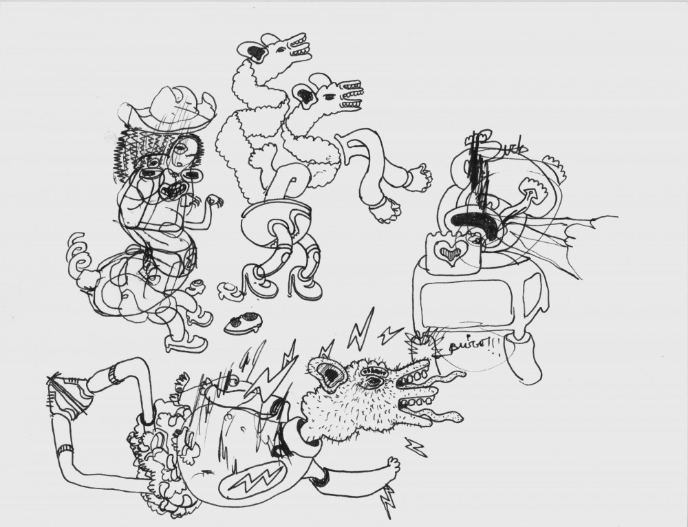
Image by Ashley Goetz
“Dog of War” is an example of art by James Paterson, who is featured in the Data Art Show. PHOTO COURTESY JAMES PATERSON
Published June 16, 2009
More to Discover